In this task I will be writing a
detail post explaining what the limitations of a television ident are and
giving examples. Also I will be talking how Typography, Colour, Aspect-ratio,
adhering and Duration can be considered a limitation to design of n ident.
Typography
Typography is a technique used to
organise type to make written language legible, readable and appealing when
displayed to the audience. Typography is one of the key factors needed to make
idents. Channel’s use typography on their brand image, which helps them
identify them from other channels. For idents they typography is kept the same
throughout the different channel the brand owns. For example The BBC channels
idents are the same with big and bold font at the end of the idents. Having the
same typography throughout the channels keeps the BBC known by the audience and
creates less mix ups with other idents. For BBC one idents they all end with a
circle with the BBC One brand image. Sometimes the circle is red because red represents
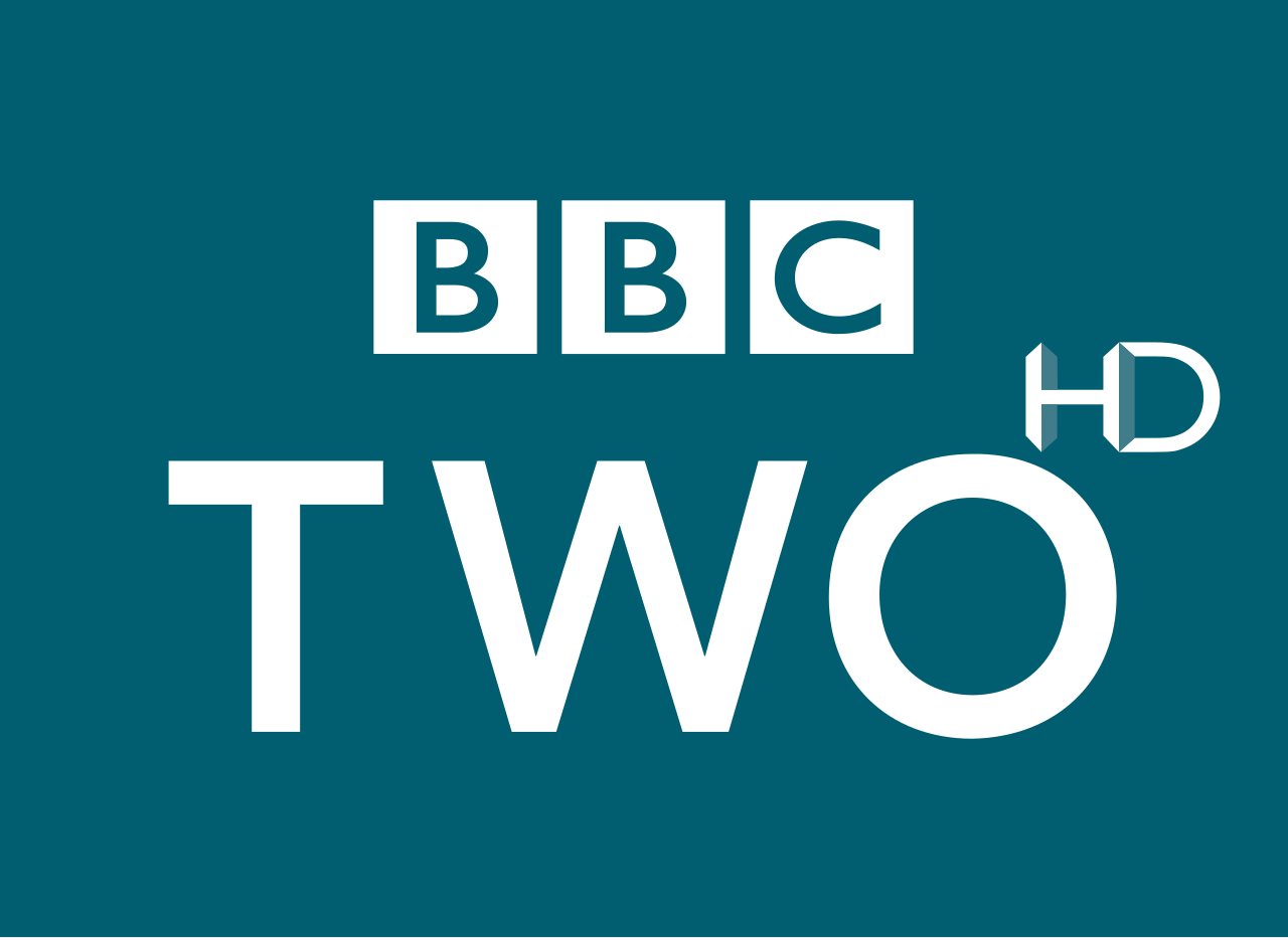
the BBC One ident trademark. BBC Two typography is the same as BBC One but it
says BBC Two and with the ident it has the number two for their trademark. BBC
There and BBC FOUR have the same typography but their colour is different. With
having all the same typography it shows how the BBC channels are connected and
how they are one brand. Nevertheless, because the typography design is all the
same it will eventually make the idents design look boring and the audience
will not like. Also have same typography will not allow the channel to stand
out for what it is.


Colour
Colour is very important when it
comes to designing and creating idents. Colour is the key element that makes
the channels standout from each other. Having a specific colour to your channel
always you to be recognised by audiences as an individual channel with its own
theme, style and programmes. Also the colour of the channel will be the same as
the idents they have. For example the channel E4 signature colour is purple and
their idents with represent the colour purple. Although channels like BBC ONE, TWO,
THREE and FOUR are the same brand but they have their own signature colour to
represent their own channels and programmes. It goes the same for CBBC and
CBeebies, as they are connected but they have their own channel and own audience.
But because it is connected, the channel cannot change too much to stand out,
meaning BBC Two changes their layout of text. The idents are the same they
cannot change to much as they have represented the channel. So it will get
unattractive if channels keep showing the same colour and design of the
idents.


Aspect-ratio
Aspect-ratio is where image is are
precise and shaped to fit the screen. So for each channels, the aspect-ratio
for the adverts, idents and programmes must be shown in 16:9 widescreen because
it must fit the screen size given, which is 16:9 vertically and horizontally without
distortion. This is because having the
wrong size for the aspect-ratio, the programmes, adverts and idents will be
shown in a different size throughout different TVs. Aspect-ratio is a lower
limitation between the typography and colour. The reason for this is because unlike
typography and colour, most of the audience have a widescreen TV, which was
built for fitting images with size 16:9 onto it. But aspect-ratio is still a
limitation because some people of the audience still do not have a widescreen
TV or have the right size TV to insulate the channels without distortion,
because of this, it will cause some of the audience to continually see the
image to be too big on for the screen, so some of its parts will be cut off
from the TV.
Adhering
Another important element to
take into content when creating an ident for a channel of programme is Adhering,
as it is important that the ident is appropriate for the audience to watch. Adhering is where channels carry out a plan, scheme, or operation to
create new content. An example of this
would be the BBC One idents, which were created to inform the audience on what’s
going to happen in the next program and to keep the audience engage with the
scheduling. BBC One channel and its programmes are aimed at younger family
audience, which includes drama, action, mystery, crime, game shows and reality TV. So the
Adhering for idents will be based on these and will be created to for appealing
to target audience of these shows. For example the BBC One 2007 ident, “Neon”,
where it is representing the “Strictly Come Dancing”. Nevertheless, adhering
has is a limitation because the designers and creators of the idents of BBC One
have to do lots of research on their target audience and the show to create an
ident that will appeal to the target audience and does not look or is identical
to other channel idents. Also it has to have a different design to keep the
audience attracted to it. Adhering to the right tone ensure that the content
for the ident or programmes will be suitable for the channel because everything
is planned out, so the design, layout, theme and the regulation is tailored to
the channels aspect. Also this will reflect TV shows shown on the channel. For
example BBC One is a channel with mystery and crime shows, so when the BBC One
does an adhering for a new programmes, they would base around their current
programmes. For example like the Sherlock Homes programme adhering has been
around The Doctor Who series, as they are both, mystery, crime and action.
Duration
Duration is where channels cut
done on time showing to fit everything onto the right time slot, so programmes,
idents and adverts will be cut down to fit the time slot. Countless idents have
been cut down to specific times to meet the right time slot given to them, so
they can keep the audience entertained promote the channel. Channels like BBC
One idents have to be cut down to 30 seconds and channels like CBeebies are cut
down to around 7-15 seconds. This is because it is very important that idents
are not kept too long as they will bore the audience because its gets dull for
certain idents. For example the CBeebies channel idents cannot be too long as
target audience young children are aged between 1-5, which means that they will
start to loss interest of the idents very quickly, so if the idents is around
30 second they would lose interest about 10 seconds. This is a limitation because the ident,
programme or advert has to be correct so it can fit onto the time slot, if it
is not then it would cause problems.
Overall it is very
important for channels to consider when making idents Typography, Colour,
Aspect-ratio, Adhering and Duration as it will benefit them in many ways. Also
it will allow the channel to understand what the audience like and dislike.
Look again at Adhering to the Right Tone - you have not explained how this ensures that the content in the ident is suitable for the channel and also reflects the kinds of television shows that are shown.
ReplyDelete